
Payment Error Optimization
Improved payment error visibility to reduce player confusion and failed transactions
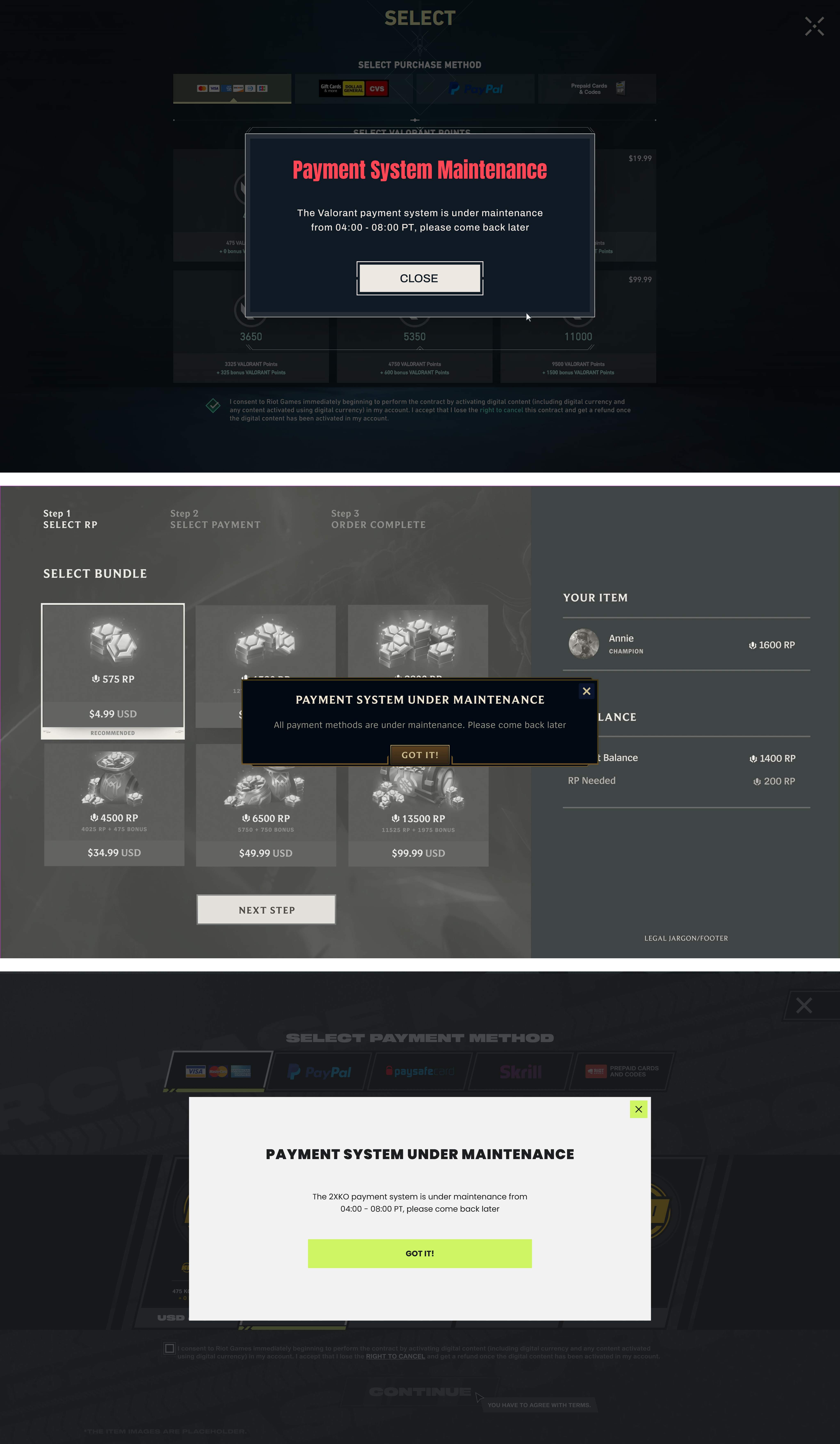
Payment alerts are often overlooked
Payment alerts are often missed on the homepage, so players discover issues only after a failed transaction. This project introduces more timely, contextual error messaging to reduce confusion and failed payments.
Enter Homepage
Players enter the client homepage, where the current alert lives.
Ignore Alerts
The payment issue alert lacks visibility and is easily overlooked on the homepage.
Encounter Failure
Players discover payment issues only after completing the payment process.
Why the current design is limited
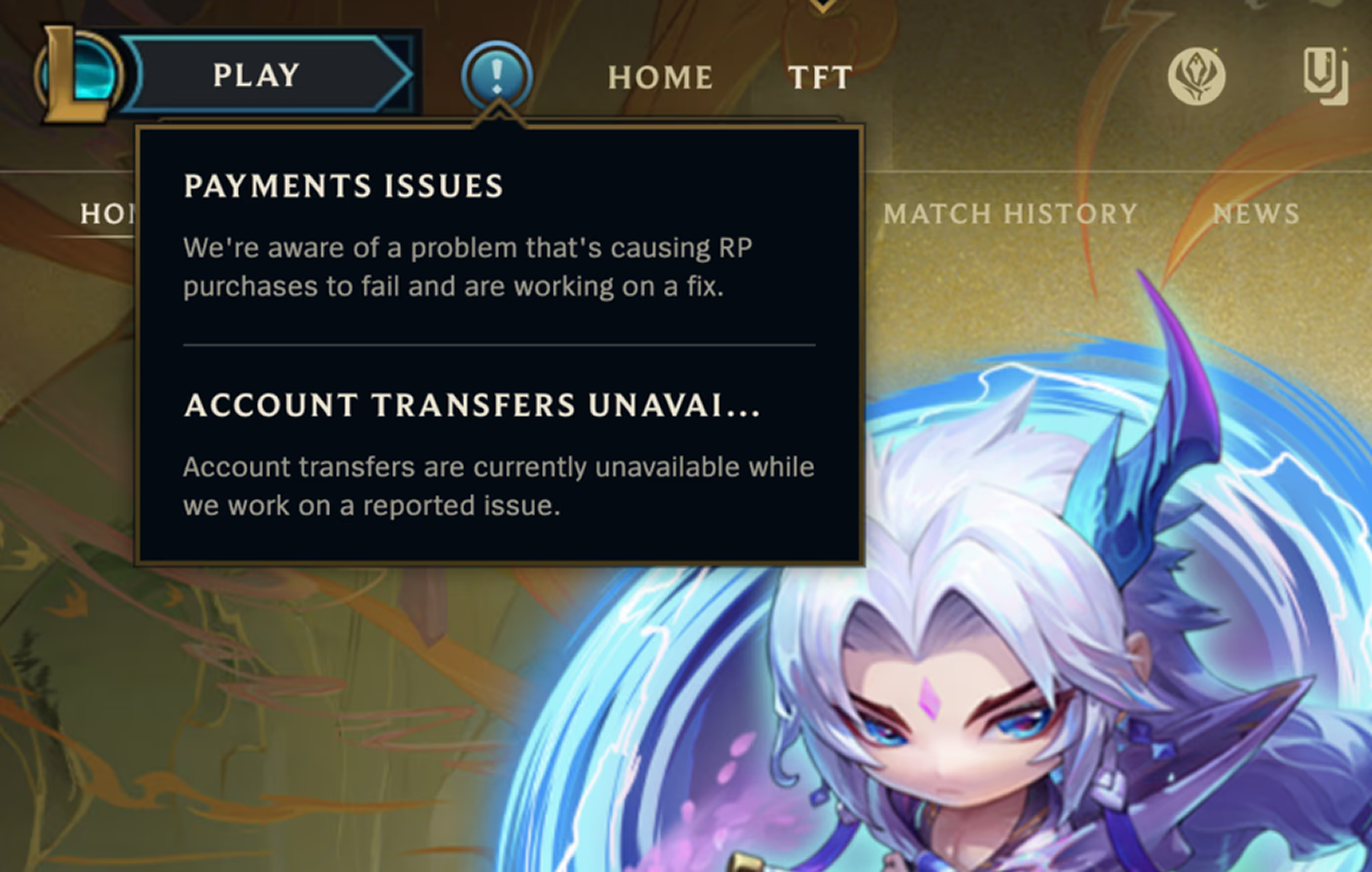
The prompt appeared too early
The homepage is outside the payment flow, making alerts easy to miss.
Users easily overlook floating content
The alert requires no acknowledgment, making it easy to overlook.
Users need to remember the prompt
Alerts shown before payment are easy to forget.
The payment interface is missing real-time alerts
Notifying users after a payment failure is too late.
The problem lies in poor timing and context, causing users to ignore the information.
Explore solutions
Most severe case: all payment methods are unavailable
Users should be clearly informed when payments are unavailable to prevent further action.
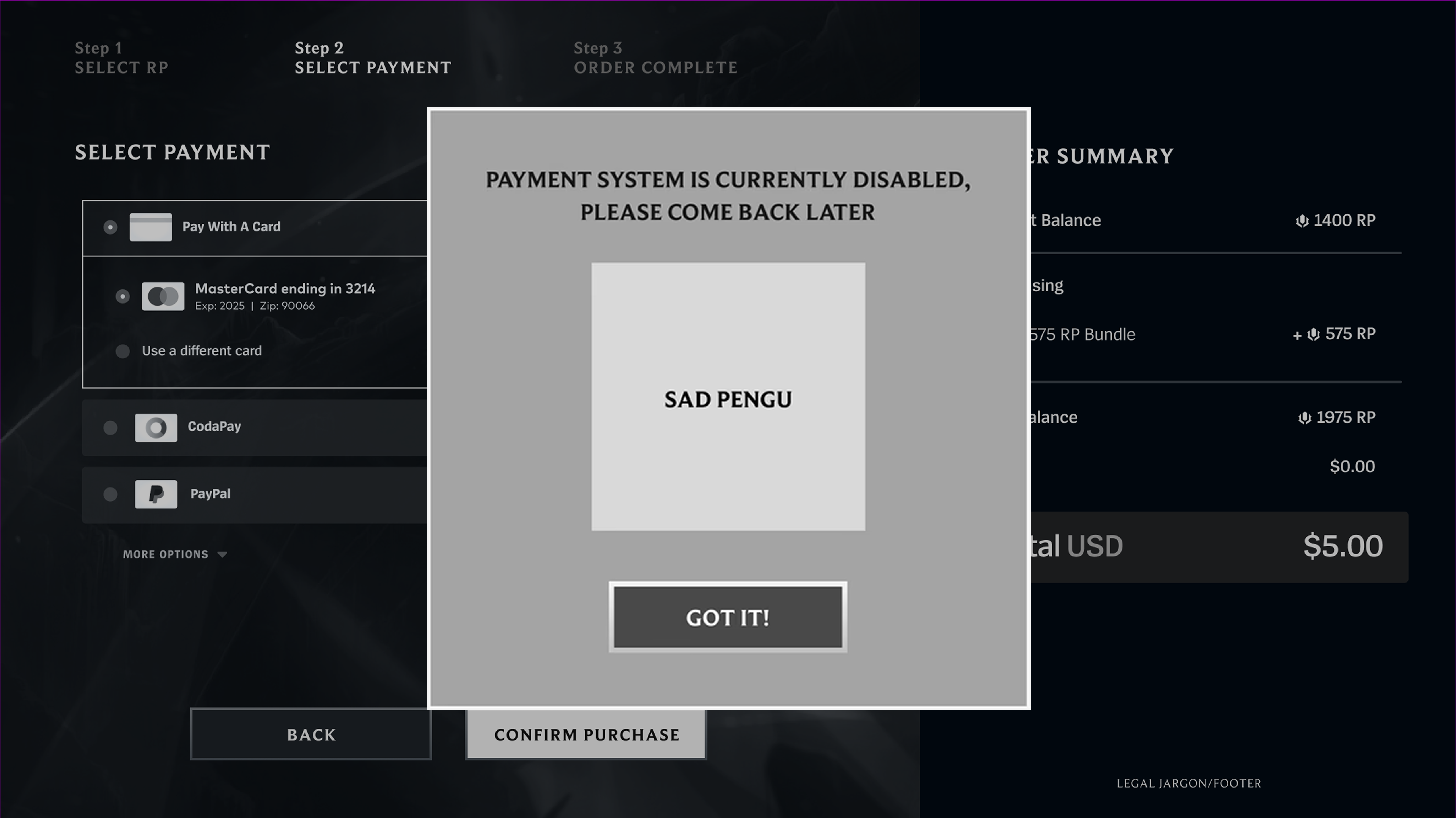
Advantages
- •Cute illustrations can reduce user frustration
- •A narrow design is more likely to attract attention
Disadvantages
- •Less consistent with the existing ticker-based experience
- •Requires more screen space and user interaction
- •Depends on additional visual assets and illustrations
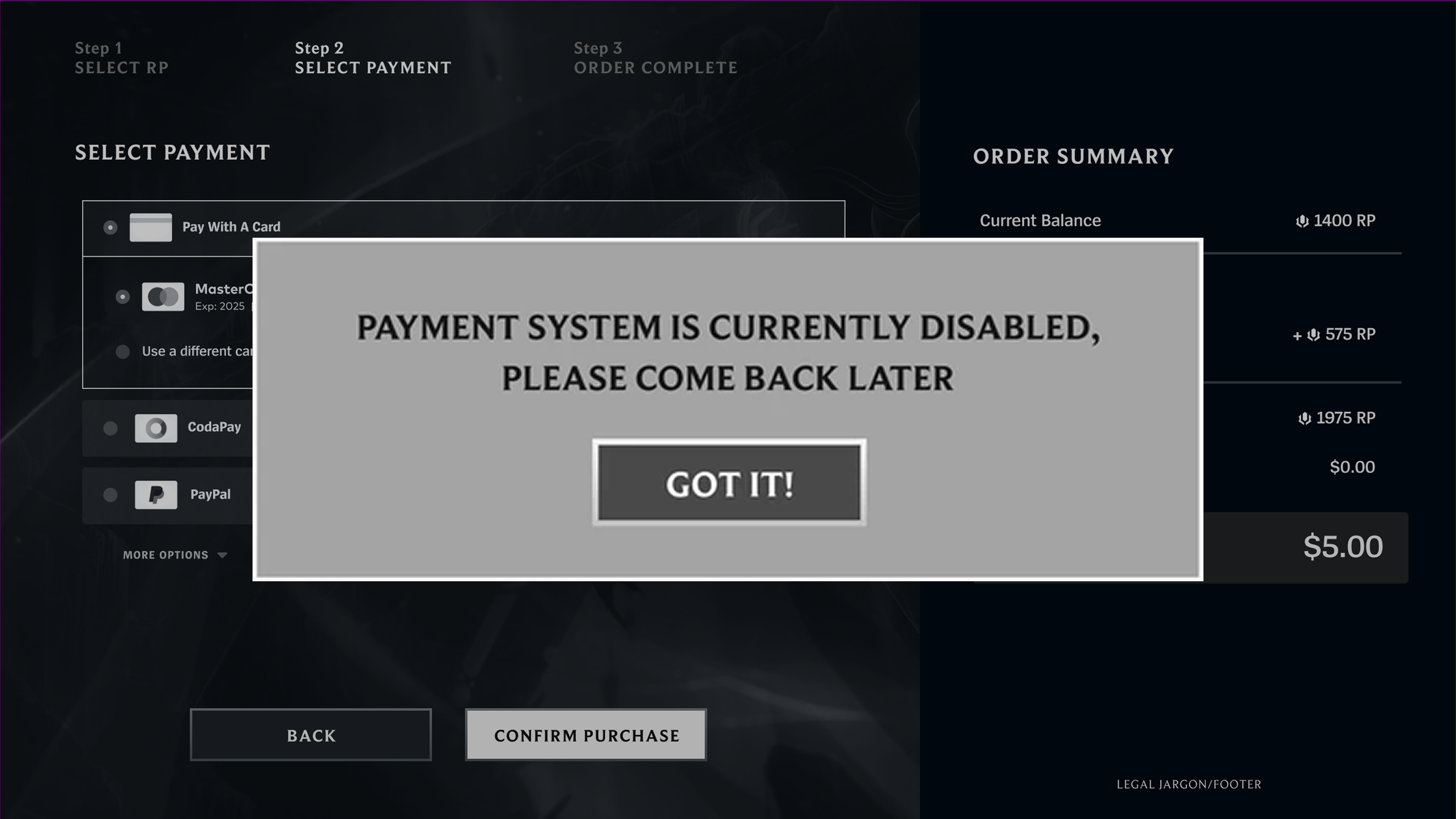
Advantages
- •Familiar interaction pattern
- •Clear, low-effort messaging
- •Responsive to different content lengths
- •Compact and highly noticeable
Disadvantages
- •May be overlooked during quick dismissal
- •Readability decreases with longer content
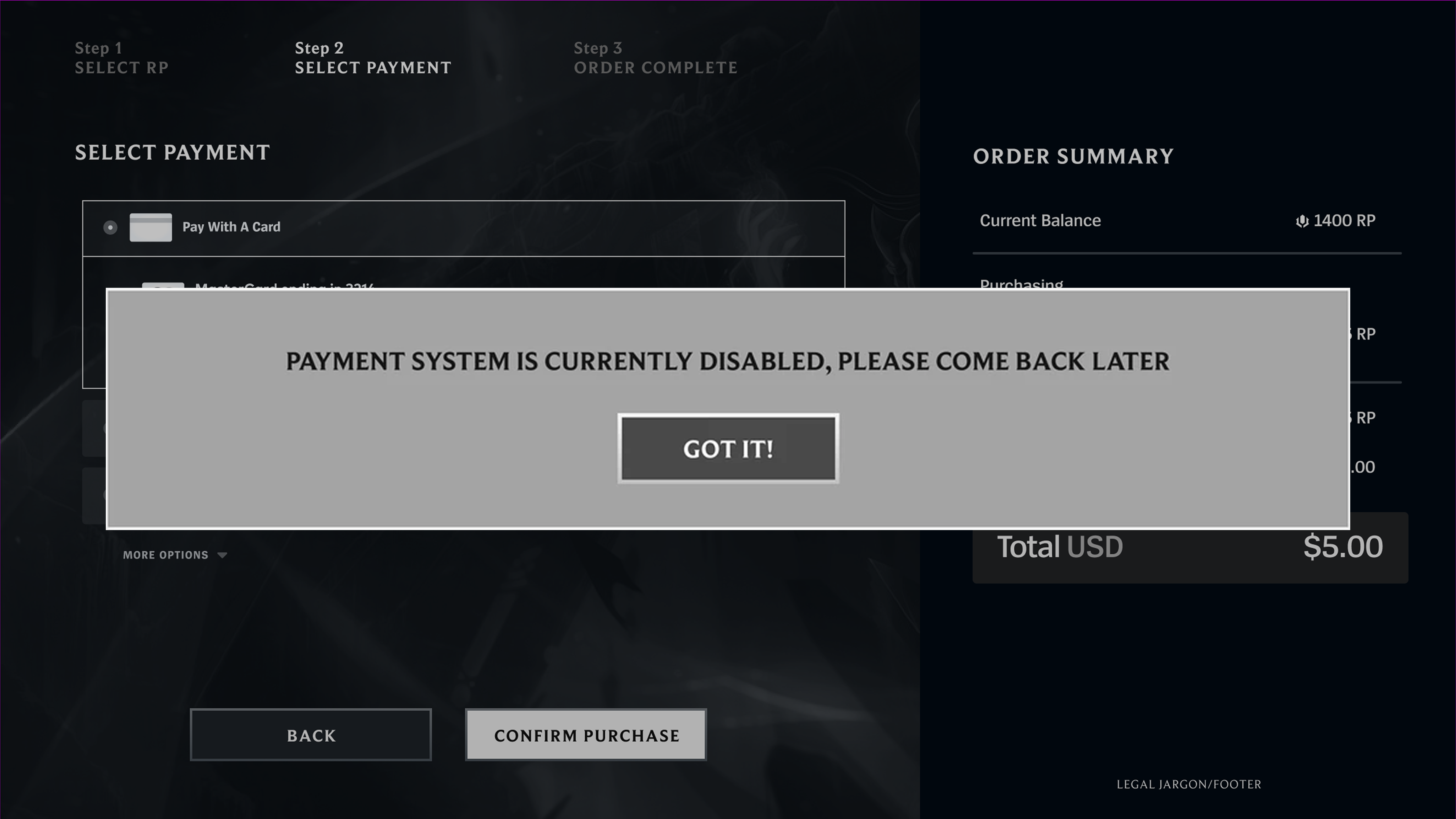
Advantages
- •High visual prominence and visibility
- •Difficult to overlook critical information
- •Supports longer and more detailed messaging
Disadvantages
- •Higher space usage and potential disruption
- •Less aligned with the existing design language
- •Long messages may reduce focus on critical information
More common scenario: 1+ payment methods unavailable
Clearly communicate abnormal states while minimizing disruption to the experience.

Advantages
- •Grayed-out states indicate unavailable payment methods
- •Tooltips provide detailed explanations for payment issues
- •No additional space required on the payment page
- •Supports method-specific error messaging
Disadvantages
- •Hover information can be easily overlooked, leading to confusion

Advantages
- •Highlighted states indicate payment issues
- •Tooltips provide detailed explanations for payment exceptions
- •No additional space required on the payment page
- •Supports payment method–specific error messages
Disadvantages
- •Strong visual emphasis may disrupt the interface hierarchy
- •Users may overlook hover-only information

Advantages
- •Captures attention without requiring hover interactions
- •Supports multiple payment exceptions in one area
- •Better aligned with future use cases in the new LoL client
Disadvantages
- •Long messages may still be skimmed or ignored
- •Top-right placement can reduce visibility
- •Requires significant page space
Key results
All payment methods are unavailable
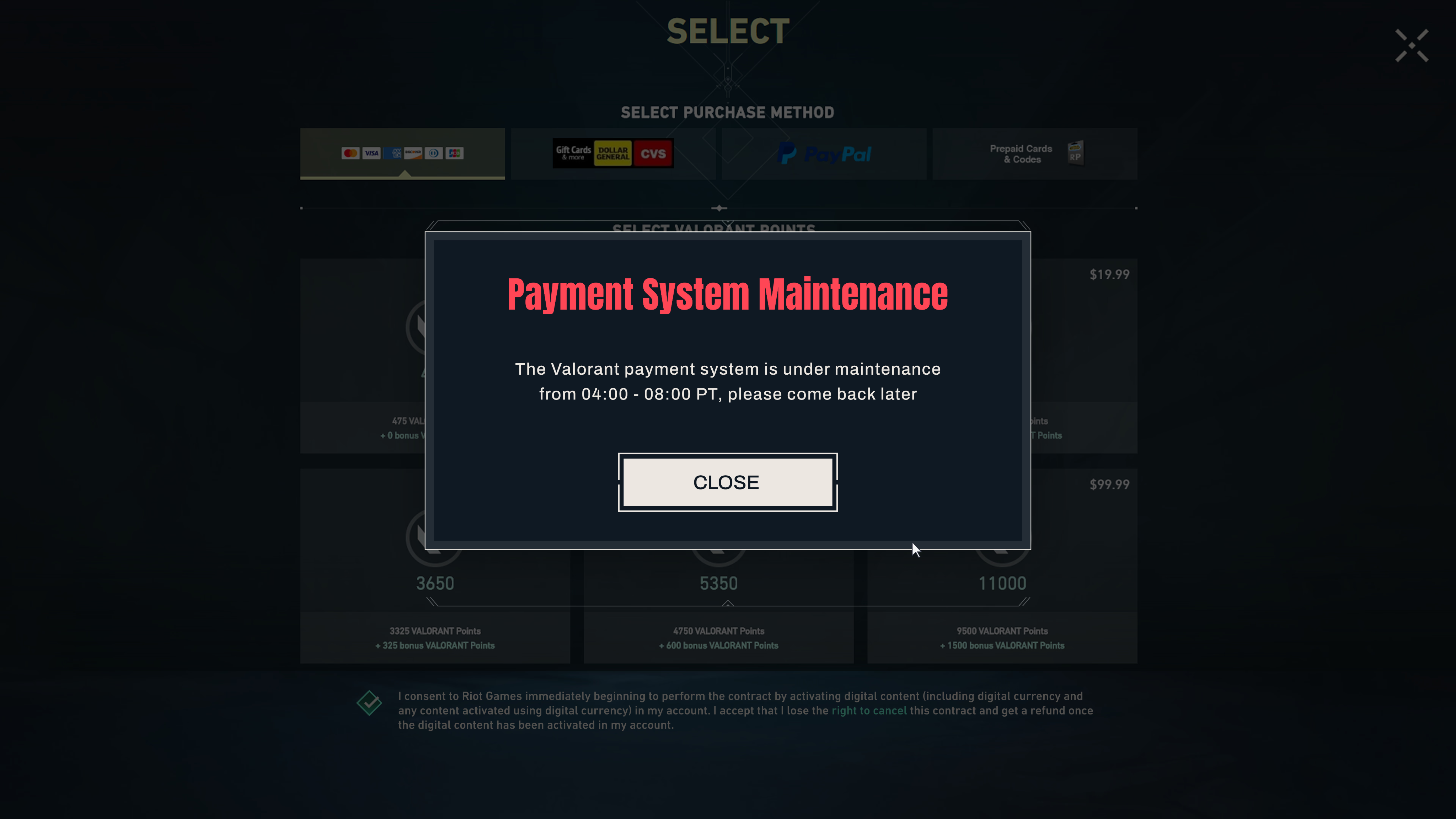
Valorant
- •Bright neon red and sharp visuals reinforce a modern, high-tech aesthetic
- •Clean, angular UI aligns with the tactical shooter experience
- •High-contrast warnings increase the visibility of critical issues
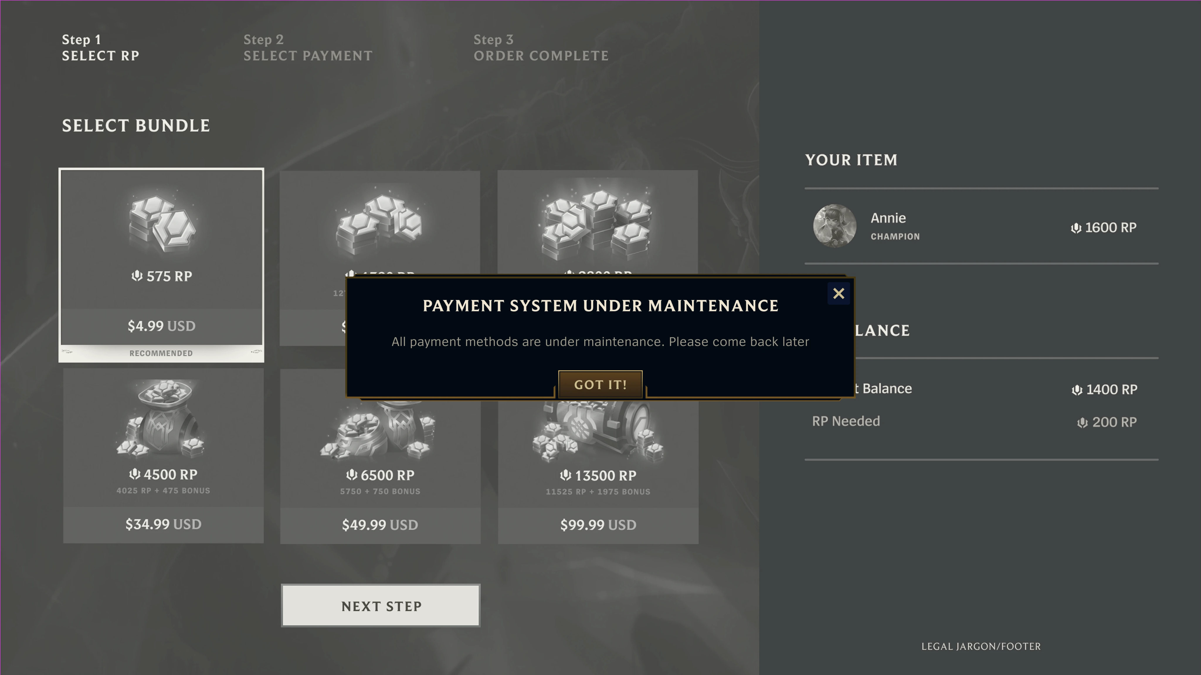
League of Legends
- •The black-and-gold palette reinforces the game's classic fantasy aesthetic
- •Capitalized and serif typography enhances a sense of grandeur and tradition
- •Improves message visibility while preserving immersion
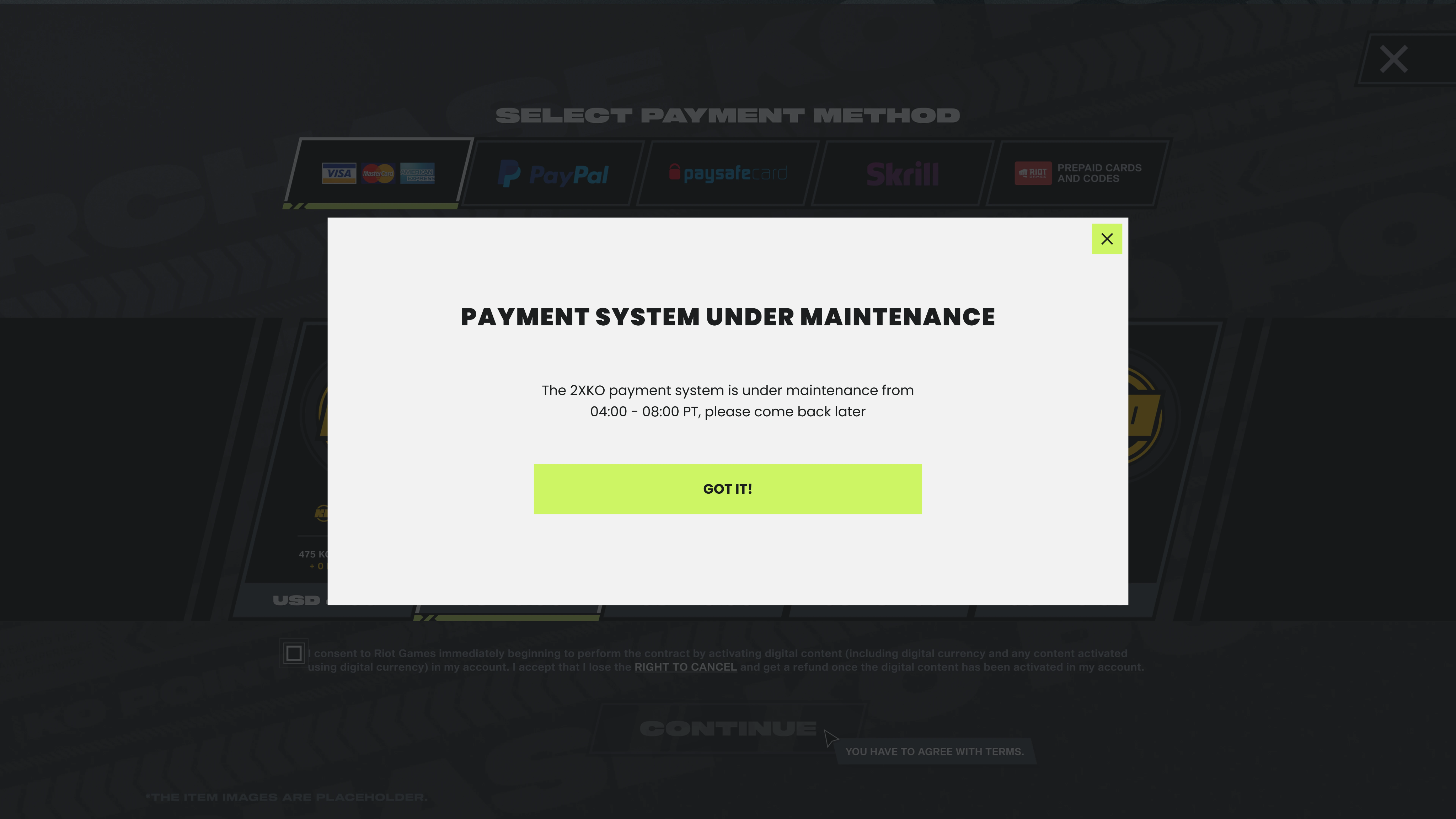
2XKO
- •The contrast between black and neon colors reinforces a modern aesthetic
- •Bold, uppercase typography reflects the power and intensity of fighting games
- •A minimalist layout makes exception messages clearer and more direct
1+ payment methods are unavailable
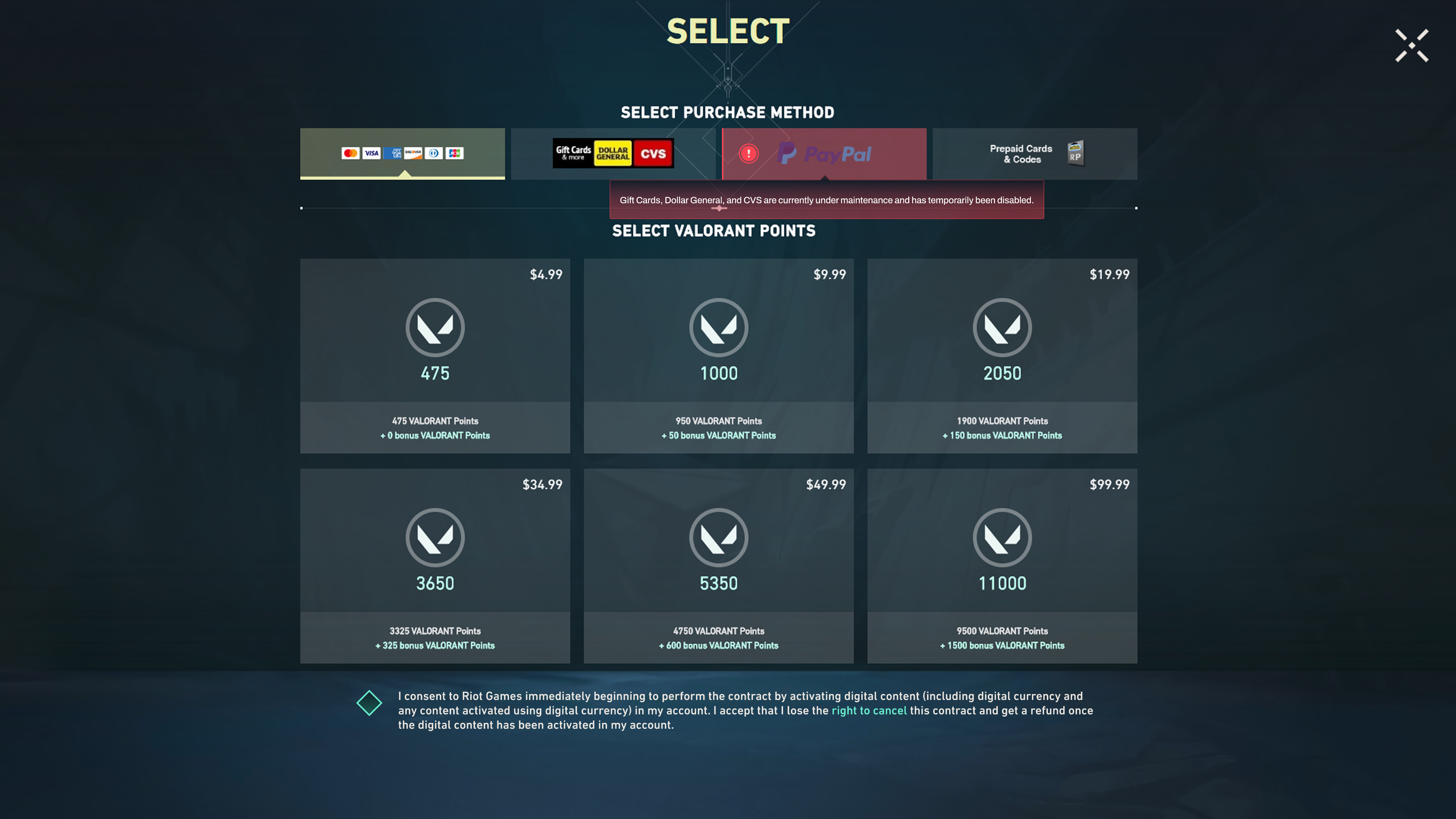
Valorant
- •Embed payment issues directly into the payment flow for a clearer hierarchy
- •Use warning-style system feedback to increase the visibility of issues
- •Maintain a compact interface to minimize disruption during payment
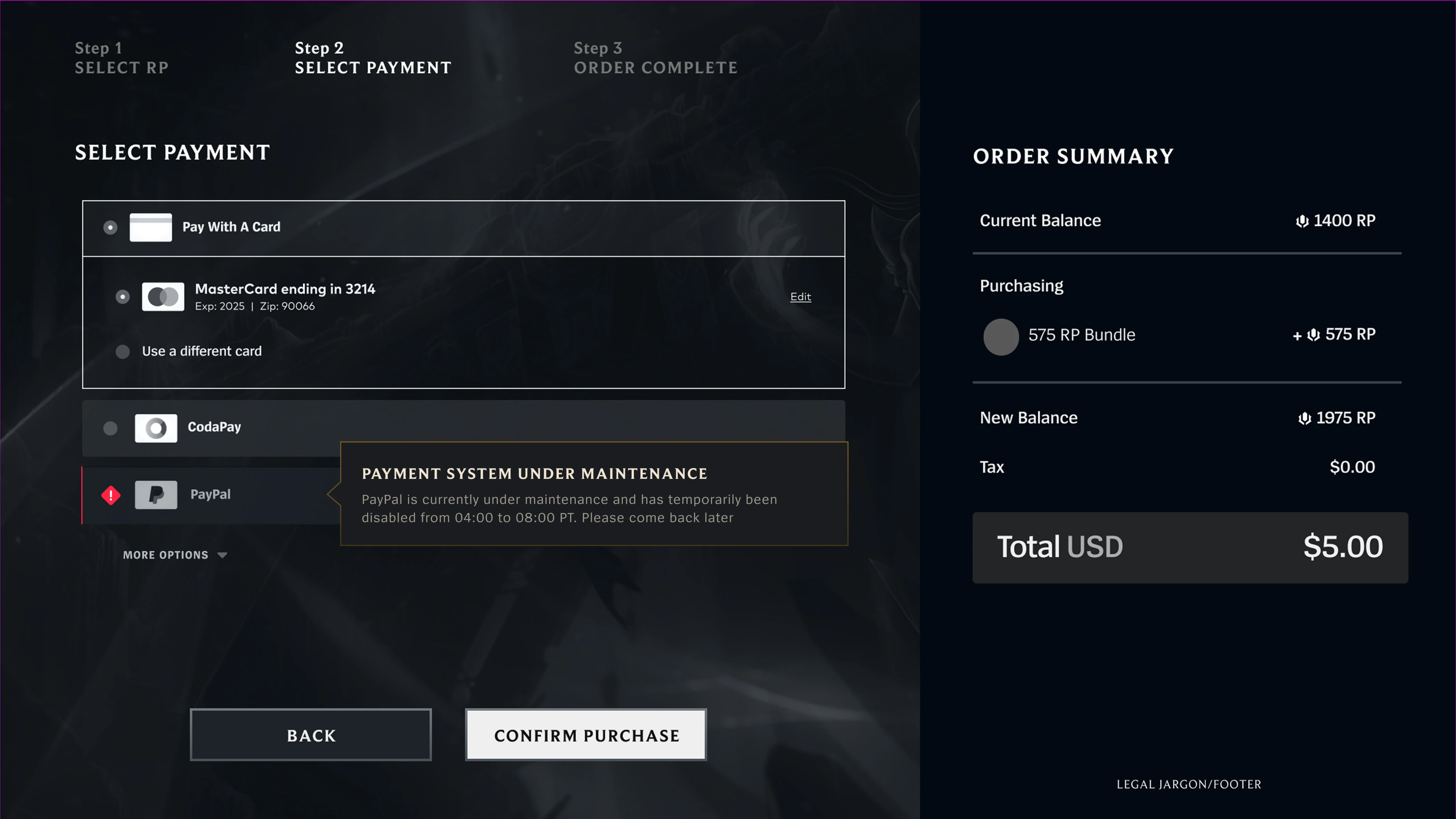
League of Legends
- •Integrates exception messaging into the game's fantasy aesthetic
- •Maintains visual consistency through established borders and hierarchy
- •Preserves high information density while staying true to LoL's UI language
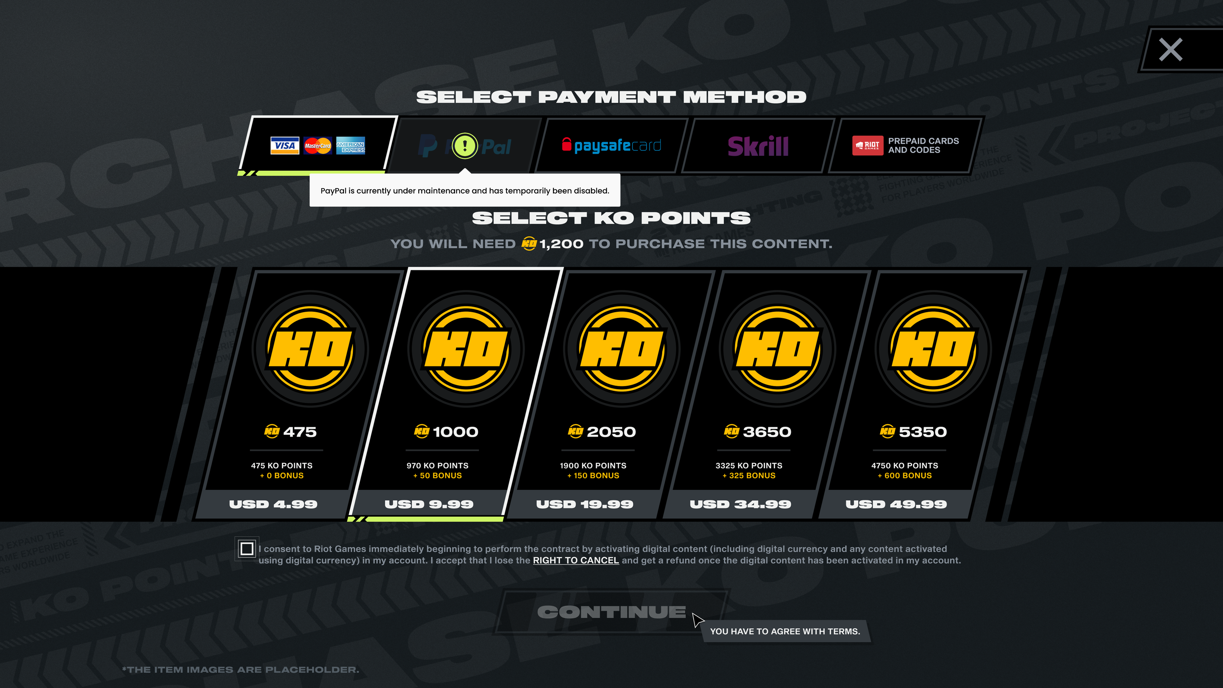
2XKO
- •Direct prompts support the fast-paced nature of fighting games
- •Improve decision-making with stronger button contrast and fewer steps
- •Maintain visual impact while prioritizing clear information delivery
Insights & Reflections
During my internship at Riot, I learned how to proactively share work, collaborate across teams, and iterate through feedback. Guided by Riot's “Player First” philosophy, I grounded my design decisions in real player needs and refined solutions through research, stakeholder discussions, and continuous iteration. This experience strengthened my UX design, communication, and collaboration skills, while deepening my passion for creating meaningful user experiences.